Dailymotion
The home for videos that matter
Introduction
Dailymotion is a French company that offers a service of hosting, sharing and viewing videos online. Created in 2005, the platform was one of the first in the field of online video and has enjoyed international success.
Today, the streaming video platform is still widely used. Indeed, Dailymotion connects more than 250 million users who watch 3.5 billion videos on its player every month worldwide. The service is based on an intelligent player, an intuitive algorithm and recommendations carefully selected by experts.
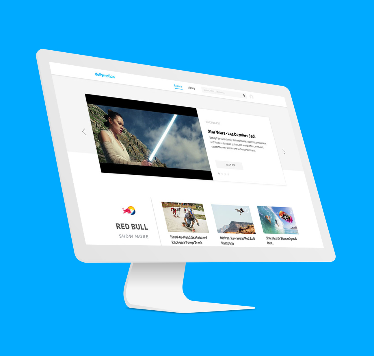
I joined Dailymotion in August 2017 when the platform had just released its new design, Dailymotion Neon. At Dailymotion, I have two different roles. The first and main one is my role as product designer and the second one is that of motion designer. I'm going to present you here my work as product designer, but if you want to discover some of the videos I made as motion designer, you can check them out here.
I'm going to present the work I've done regarding the discovery of new content on dailymotion. A first part will present the discovery work that the design team did during an intense week of workshop. The second part will present how we integrated what we discovered during this week into the product..
The new version of Dailymotion had just been released and we were already thinking about the improvements we could make. One of them was to improve content discovery on the website as well as on the application.
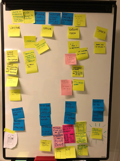
During one week, we organized a workshop to clarify the vision we had of Dailymotion for the coming year, to know what we wanted to focus on and to create some first design ideas.
Goals
Find our vision
Clarify what we wanted and understand how to achieve it.
Iterate some first ideas
Create a few prototypes with an open mind.
Analyze and focus
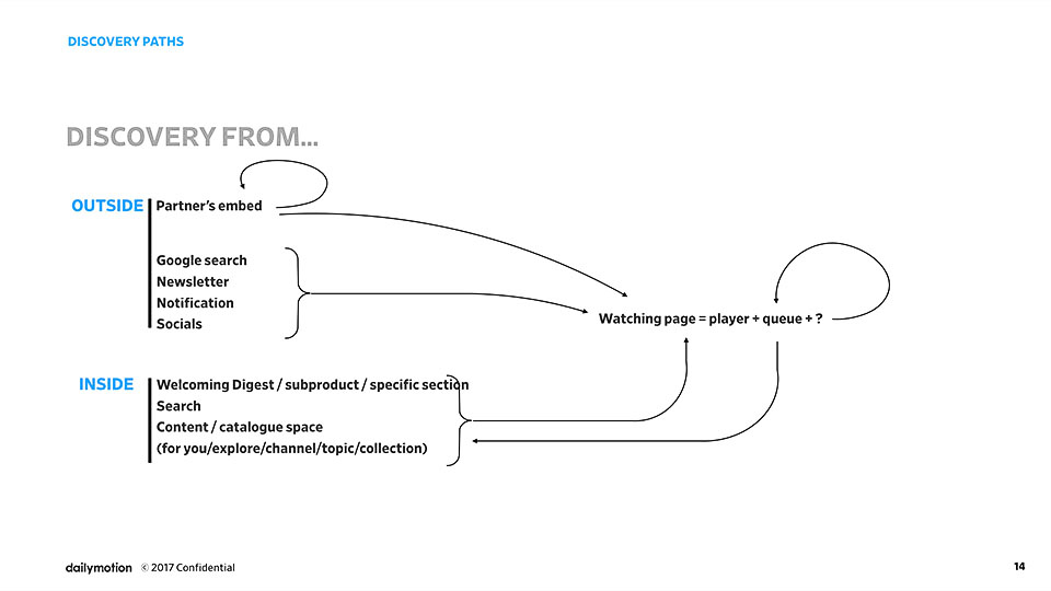
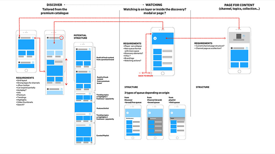
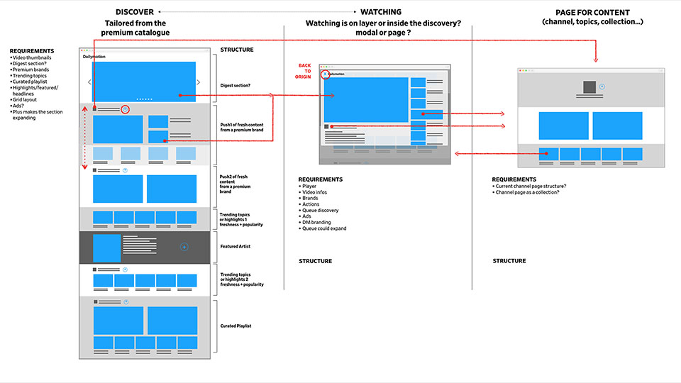
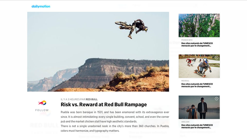
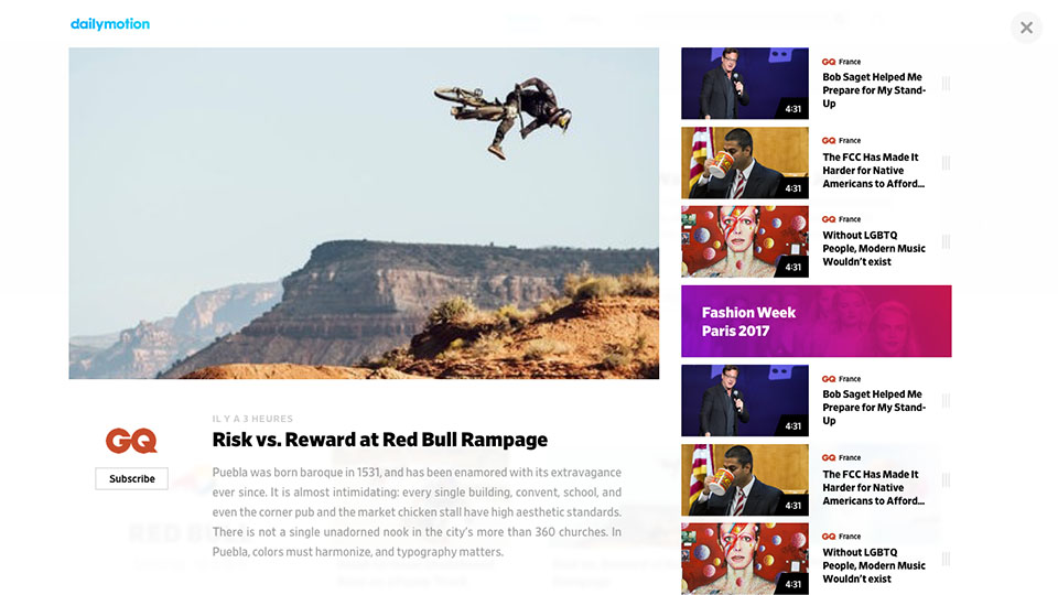
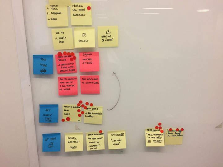
Quickly, we identified the main starting points towards discovery on Dailymotion. These 4 main points in our application were: the watching page, the content/catalogue space (for you + explore pages), the search but also all the places where our player is used embed (other sites, newsletters....)
From there, we were able to create a few paths leading to the discovery of new content.
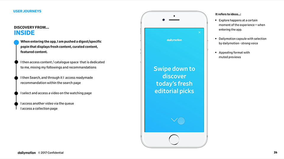
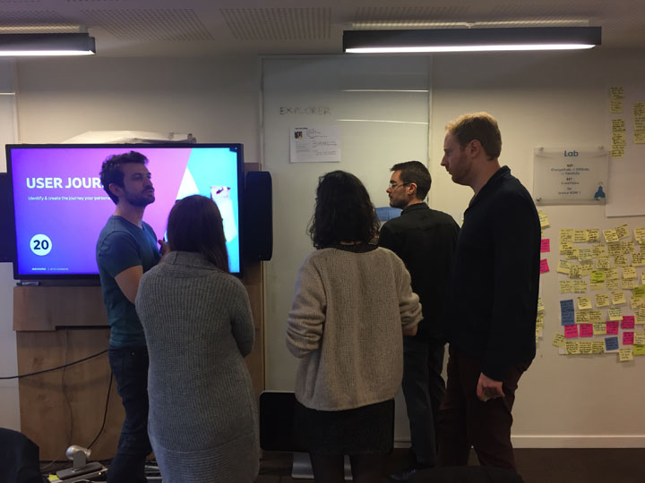
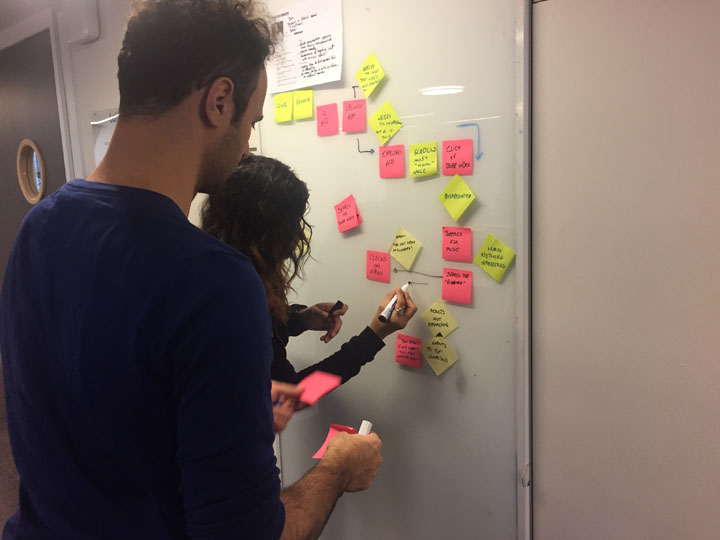
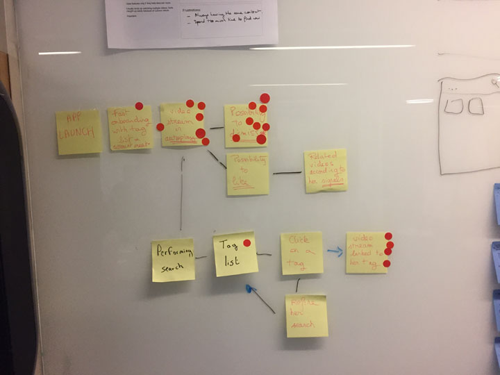
User journey
From there, we decided to focus on two main paths and thanks to this we were able to create different user journeys. These paths helped us to better understand our users and to find out where and how we could make them discover more content.
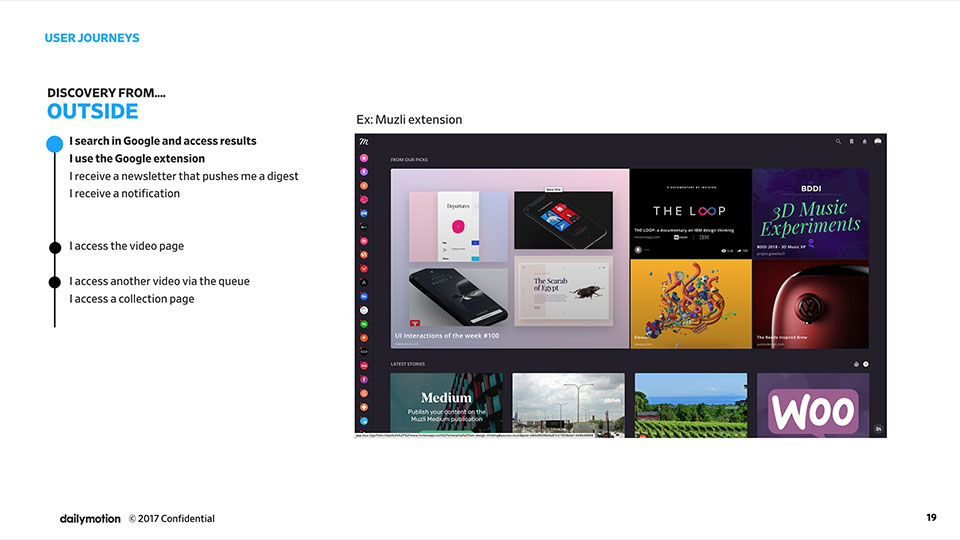
We finally arrived at a first satisfying solution and we started working on the general flow, interactions and details.
Solutions
We first started doing a few different design iterations.

But in the end, after a few tests and a few more thoughts, we came up with this solution. We wanted to test something different, with a double navigation allowing almost permanent content discovery.
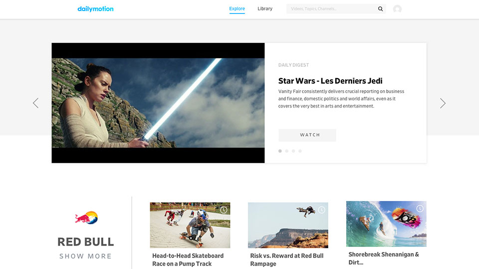
Discovery in one place
We wanted to greatly simplify our website by creating only one space divided in two. On the left, the trending videos and on the right the different topics.
Discovery is topic oriented
We wanted to focus on our subjects which are a fundamental value of our product. These are fresh and actual topics that bring together videos related to them.
Player is in the queue
When users launch a video, we wanted to leave them on the same page so not to disturb their discovery. The video in progress thus goes to the left side and the other videos in this part become the queue.
Persistent watching
Again, in order not to disrupt discovery, the video shrinks to allow more content to be discovered.
Never endend discovery
If we notice that the user scrolls through a lot of videos without finding anything appealing to them, we suggest that they refresh all the topics to offer them something different that will appeal to them more.
During the workshop, we concluded that one of the aspects we wanted to improve in our product was discovery. So, some time later, I worked on a project that was a direct follow-up: "discovery in native". This project focused on discovery in the native application on all pages, except for the watching page on which another group worked.
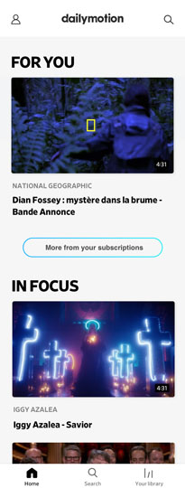
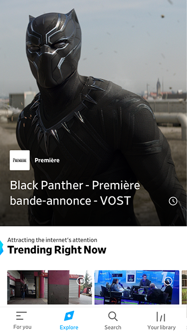
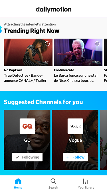
At this stage, we were offering a selection of varied content from premium sources on Dailymotion. Our product was separated into two parts: the "explore" section where you could find all the trendy and popular videos and the "for you" section where you could find videos from the channels and topics you followed and videos related to your interests.
But according to our data, our users did not explore our content much and did not use the "For You" space. Therefore, they did not see the full value and scope of our offer.
Problems
Thanks to the data, we discovered 3 places in our application that could cause the previous problems.
The user either doesn’t know how to use or is not interested in it. It doesn’t create loyalty.
Is not used for what we wanted it to be used. Nor it drives users to the watching.
Currently show the lists of channels & topics but users want to see recent videos that they missed from these channels & topics.
Goals
Raise commitment
We wanted users to become more interested in our content by watching more videos
Reorganize
We wanted users to interact more with our content by following more channels and topics
Workshop
01. Design sprints
We first did a design sprint led by the design team for two days. The objectives of this workshop were to gather ideas and create the first concepts.
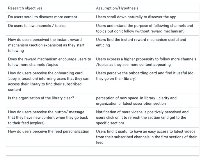
Through this workshop, we were able to identify the biggest pain points and challenges. We also established a clear set of hypotheses that we wanted to test.
02. Main principles
Back to simple. We want to remove extra choices and guide the user towards the direction of content discovery.
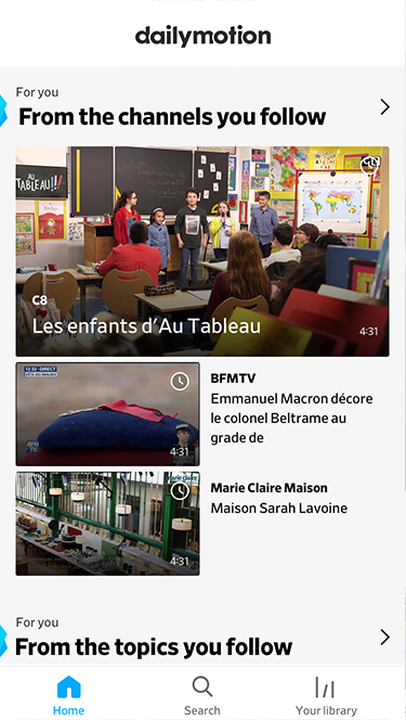
By showing "Latest from the subscriptions" section and other personalized content first, we keep the user motivated to continue further into discovery.
Big and consistent components allow quick scanning of the content and are easier and faster to read.
User is more inclined to hit the follow button if he knows what is behind the proposition. To ensure greater readability, we present only one list at a time.
Immediate conent update, improved animations and messages from the system.
In order to make following channels more natural and effortless, we made it part of the content.er towards the direction of content discovery.
If content allows it and the user wants it, we should let him discover endlessly.
In order to give a sence of direction and structure to the user and to make sure we cover all possible interests, in a discovery we organize the content in clusters (suggestion:sections per verticals).
Base
Once the principles were defined, we worked on different wireframes exploring different options. We paid particular attention to micro interactions.
Solutions
One place to discover !
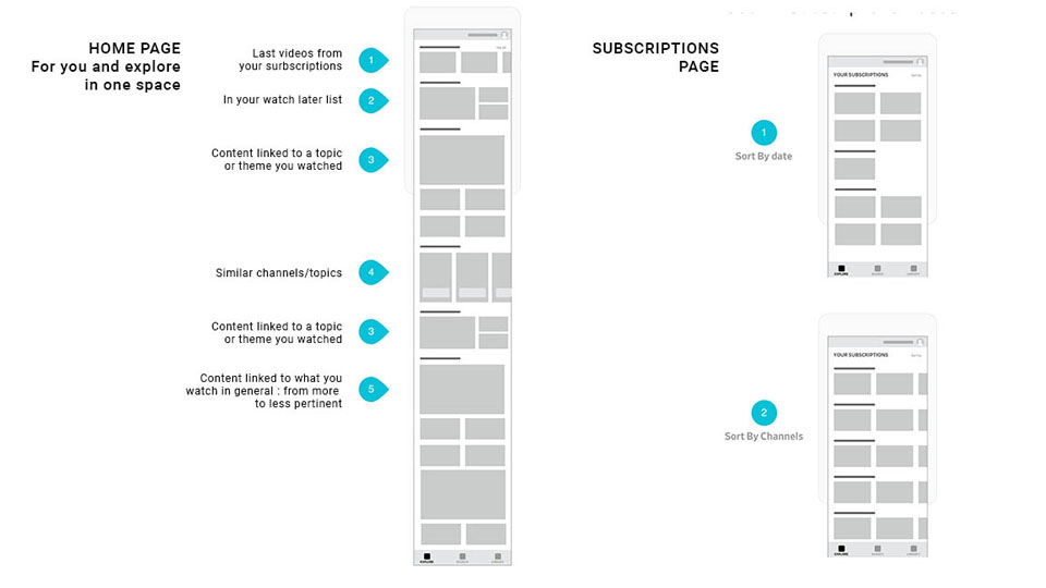
We decided to present videos that are closely related to the interests of our users first, followed by more varied content to allow them to discover new topics.
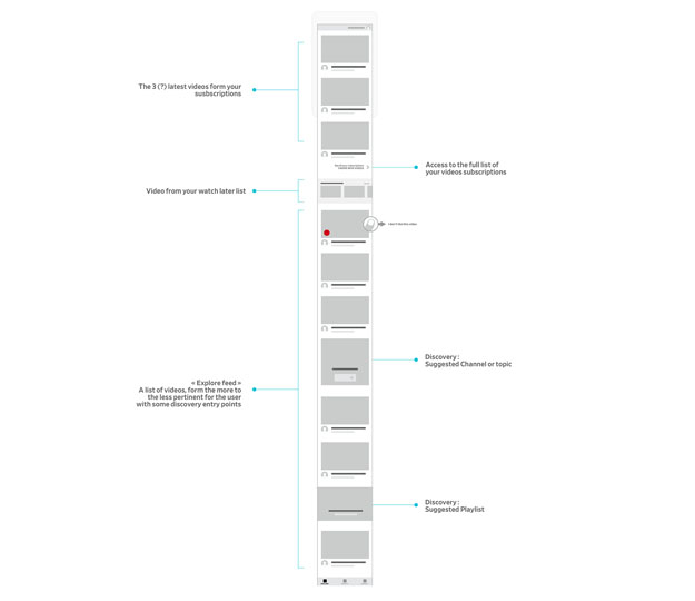
Personalized zone
The first section is the custom area. It is a space where users can find videos related to their interests. It is divided into sections that are easily identifiable for the users because they are directly related to their previous interactions (watched, liked, added to a playlist etc...).
Discovery zone
The Discovery Zone is a space where users interact with editorial content and content from our verified premium partners. It should be diverse and offer users many opportunities for discovery outside their bubble of preferences.
Interaction
We wanted all interactions to have a clear visual response so that users have a confirmation of their actions. The application also updates itself directly as a result of these interactions.
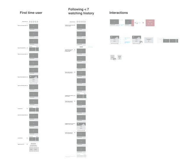
FIrst time user
First time users are very important to us, which is why we wanted to offer them more and more varied content to discover so that they can quickly access the personalized experience.
Steps
The previous screens were about our vision, our main goal, but it was obvious that there were too many changes to make at once. So we divided our entire process into different small steps that work coherently, both independently and in relation to each other.
User testing
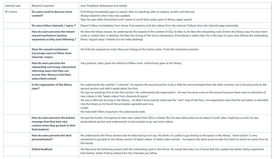
With our first designs and our first steps of definition, we carried out user tests to confront our hypotheses with real users. We learned a lot from their feedback. Most of our hypotheses were confirmed but others had to be reworked.
Thanks to this crucial step we were able to improve our designs with a new iteration.
Conclusion
Working on a product that I have used a lot personally and that many users continue to use on a daily basis is a task that is close to my heart. Examining problems and finding solutions to them is an exercise that I also find extremely important and exciting.
With these projects about content discovery but also all the others I've been able to realize at Dailymotion, I learned a lot about the different steps of the design process and design thinking.
I also had the opportunity to organize many user tests. It's a part of my job that I find most interesting. Testing ideas, getting direct feedback from users and then being able to improve your design is something I find as fundamental as it is rewarding.
Dailymotion is a large company, which allowed me to work with many different people at the same time, coming from different parts of the organization. Other designers of course, but also people from data, product managers, developers from different platforms etc. Working with all these people has taught me the importance of communication and collaboration in order to move a project forward properly.
Thanks for reading ! ✌
If you want to discover more awesome projects, click here !
Watchever
UI/UX/Motion
Help Center
U/UX
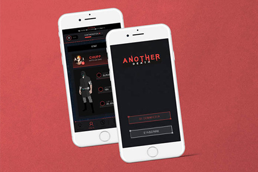
Another Death
UI/UX/Game Design
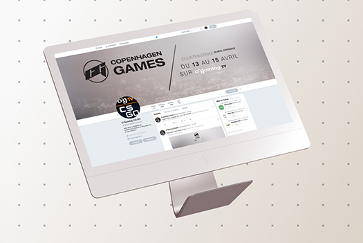
O'Gaming
Graphic Design