Watchmusic
A video centered music application
Introduction
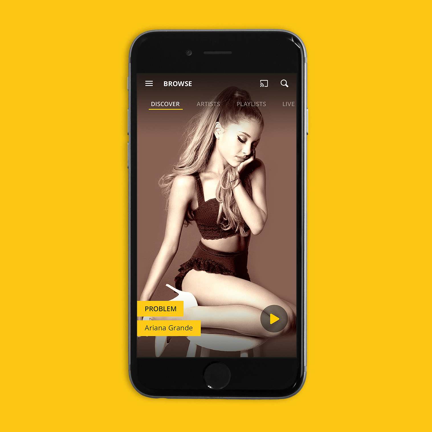
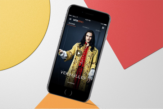
Watchmusic is a premium service that offered music-focused videos, be it music videos, concerts or interviews. Originally, the service could be accessed in two different ways: either with the Watchmusic website and standalone application, or with the Watchever service (check here) which offered a music category that actually corresponded to Watchmusic. The latter service was however closed because the company wanted to concentrate its activities on Watchmusic only.
When I arrived at Watchever, the company in charge of Watchmusic, the standalone application already existed but with the closure of Watchever, it was necessary to improve some of its aspects but also to add new features.
My missions were mainly focused on the application, which was a central element of the project. I mainly worked on some functionalities such as lyrics, notifications or the whole interaction and animation part.
Goals
Premium
Watchmusic is a premium service. The application therefore needed to be particularly neat in terms of visuals and experience.
Improve the existing
We had to clearly distinguish between cases where we simply needed to improve the existing service and those where we needed to add brand new features.
Research
01. Music service benchmark
To improve our service, we had to be really attentive to the market and monitor all competitors, new or not. So I did a lot of benchmarking on competitors in music applications.
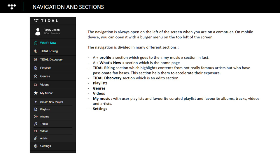
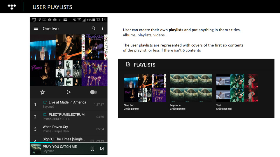
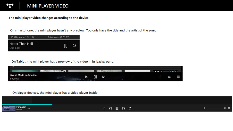
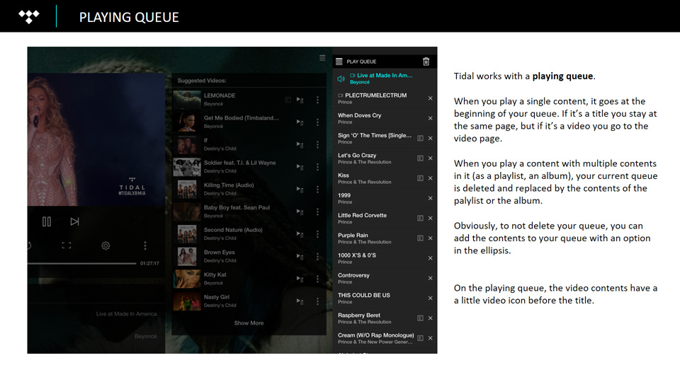
One of the services I studied was Tidal. Tidal is a subscription music streaming service that combines lossless audio and high definition music videos with editorial content. It was launched in 2014 and relaunched in March 2015 by Jay Z. One of the reasons we were interested in this competitor was that it was a premium service. So when benchmarking, I pay attention to the premium aspect (the price, the different subscriptions), but also and obviously to all the features of the application, what the user can do or not do.
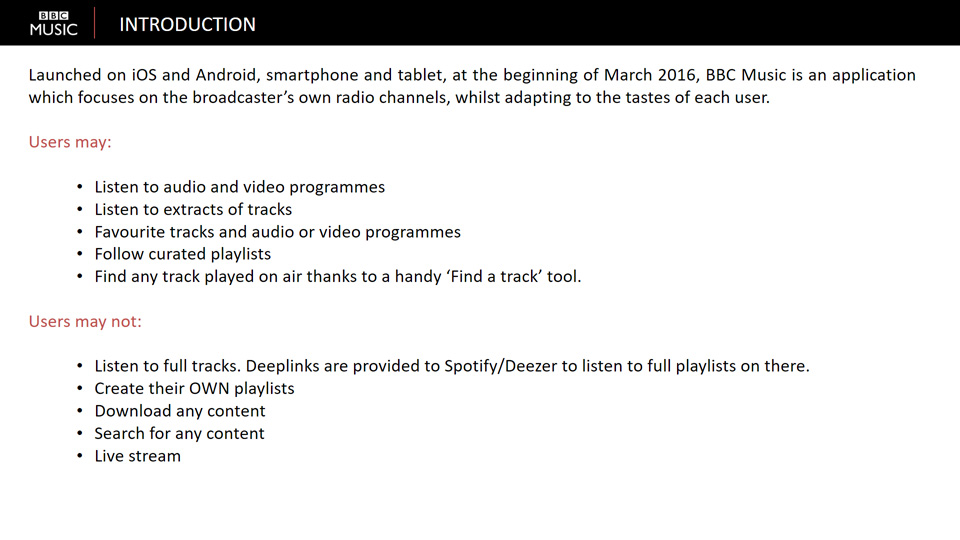
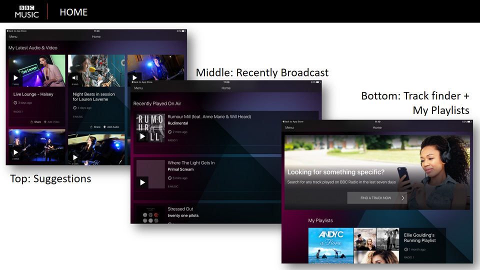
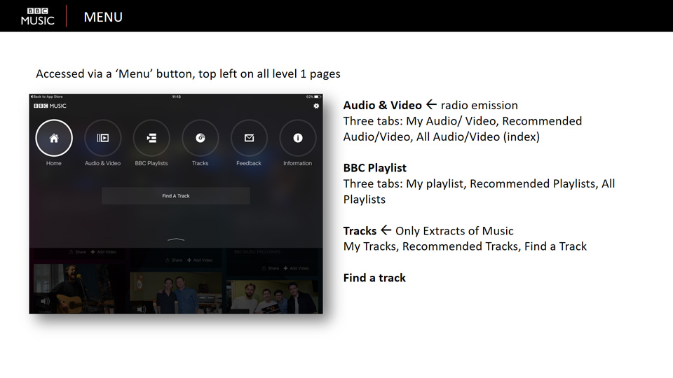
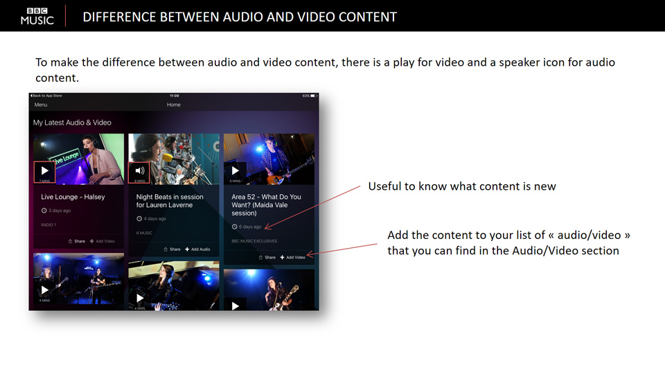
The BBC launched its BBC Music application in early March 2016. BBC Music is an application that focuses on the broadcaster's own radio channels, while adapting to each user's tastes. As a new service on the market, it was obvious to benchmark it. Moreover, the application focuses on the radio aspect of it, which is quite unusual, so it was even more rewarding to analyse it.
02. User Testing
Watchmusic was not a complete new application, there was already a first version. So we had the opportunity to do some advanced user testing. Unfortunately, as the application was only available in Brazil, we could not test it with real users. But we did tests with four new users to get their first feedback and to analyze their overall understanding of the application. The tests were really detailed, so with the results we were able to target some problems with the application as well as some really positive points.
It was a really interesting experience because it was my first real user tests and I really enjoyed doing them! At the end, we analyzed everything in detail and I made some videos to synthesize the issues raised during the tests.
Features - Home
During this project, I did a lot of animations and the first thing I focused on was the animation of the homepage. The homepage was very important, but we didn't know exactly what we wanted to do with it for a while and it took us a long time to figure it out. In this project, I mainly did the animations and sometimes suggested some visuals. You can see below the different proposals we made from the very beginning to the final version! It was quite an evolution!
We first started with the idea of cards. So we animated very simple card elements that stack up.
Then we wanted to try something with an autoplay, so we tried another design.
But in the end, we went back to what we had in the Watchever application: a large full-screen thumbnail to give a better immersion using beautiful visuals.
Features - Notifications
01. In app notifications
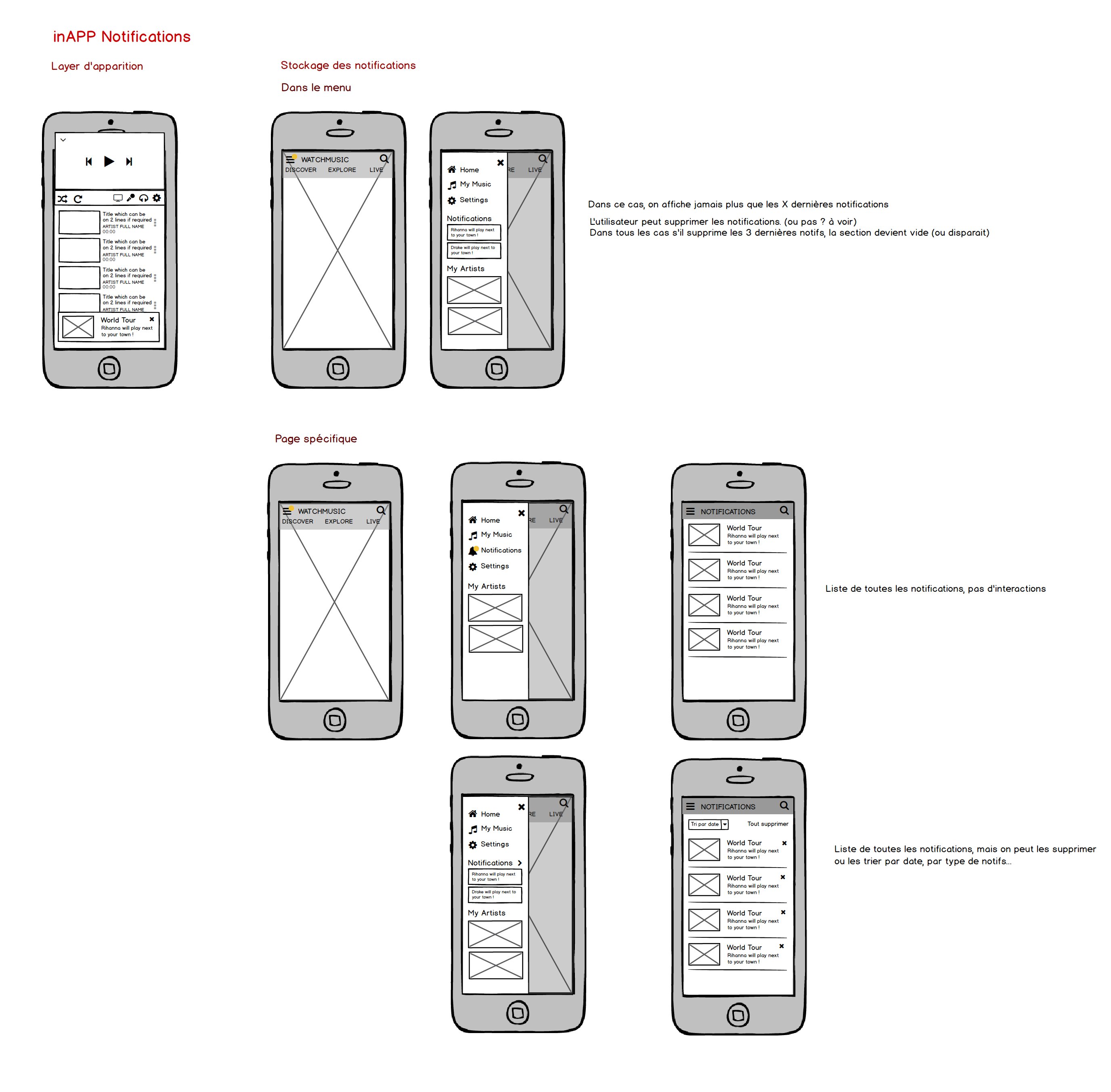
When it came to notifications, we have been working on two different types of notifications. Firstly, notifications within the application itself. There were two main problems to solve. Where and how the notification would appear: "How am I alerted when something happened while using the application?" And where would the notifications then be stored: "Where can I find my previous notifications?".
02. Push notifications
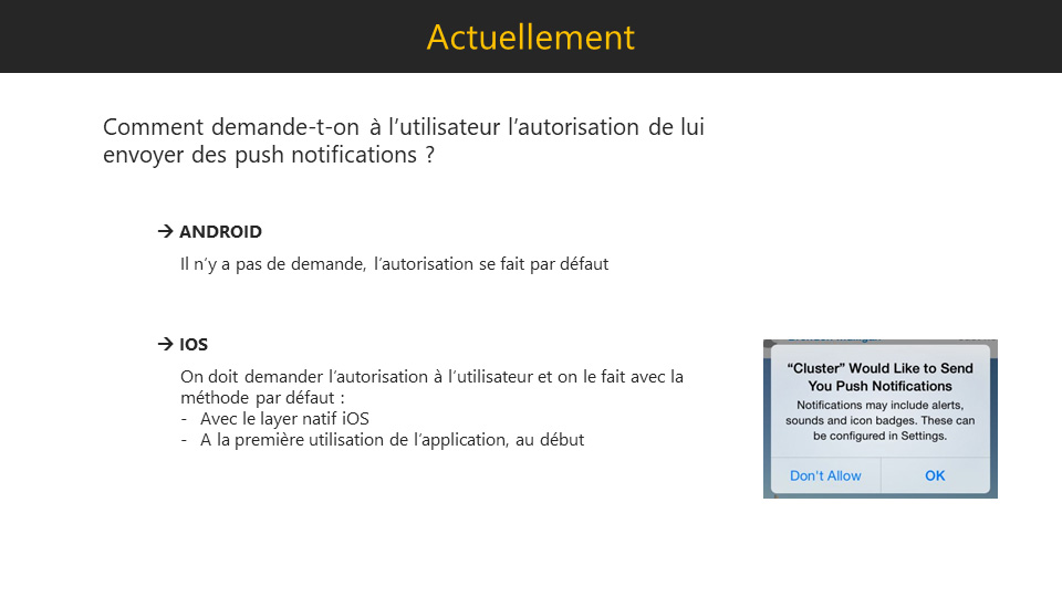
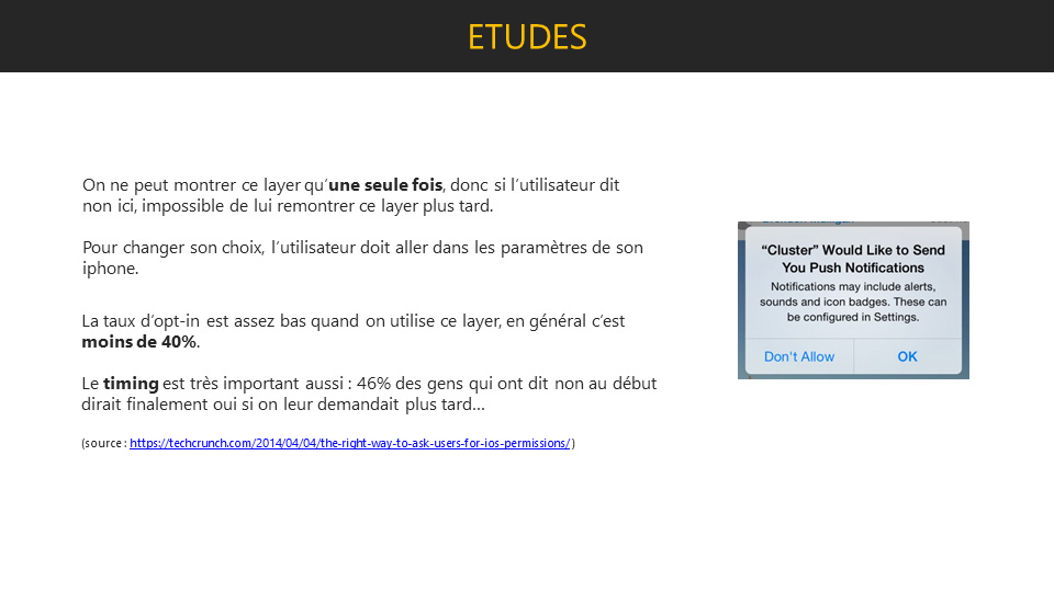
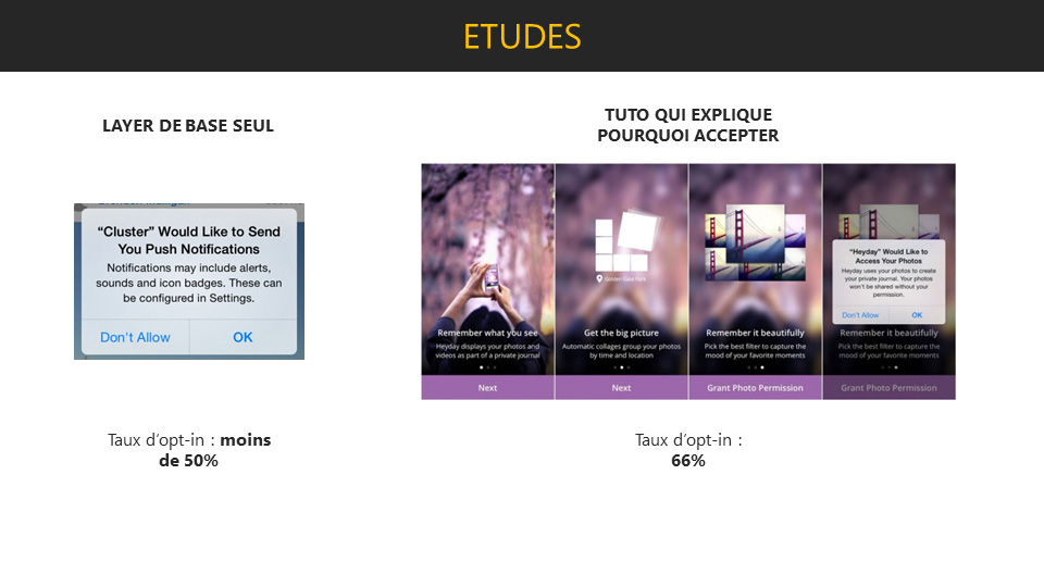
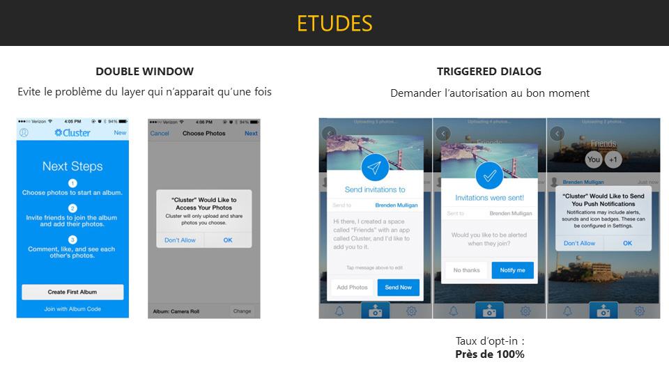
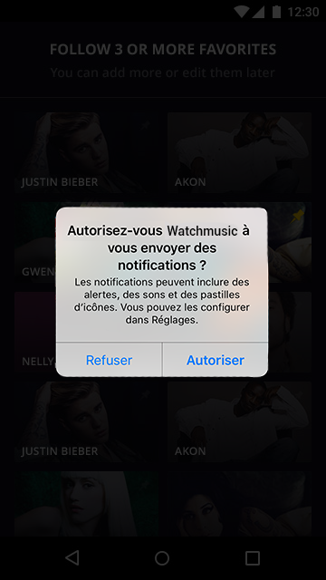
The second type of notification was Push notifications, the ones you receive when your application is closed. The problem with these notifications is that in order to send them to the user, the user must first accept the notifications (at least on an Apple device). So I did some research on existing studies on the subject.
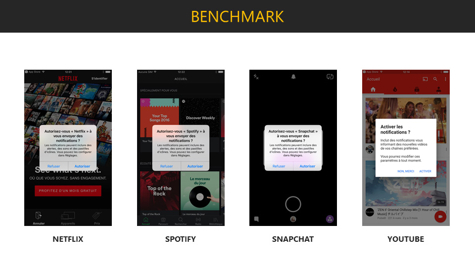
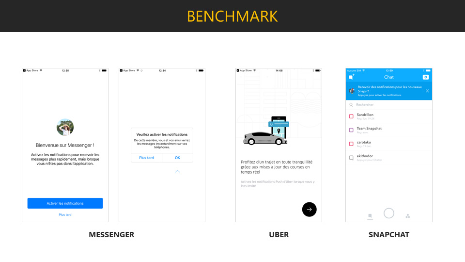
I have added a benchmark to these searches showing the common uses of these notifications.
Finally, I have proposed two solutions to this problem.
Perfect timing
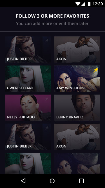
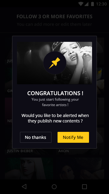
The first solution I recommended was the arrival of a double layer at the right time, i.e. when a user has just followed something. This is probably the time when the user is most likely to accept notifications to receive news from their new subscription.
A nice tutorial
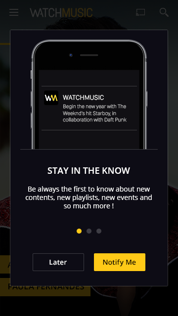
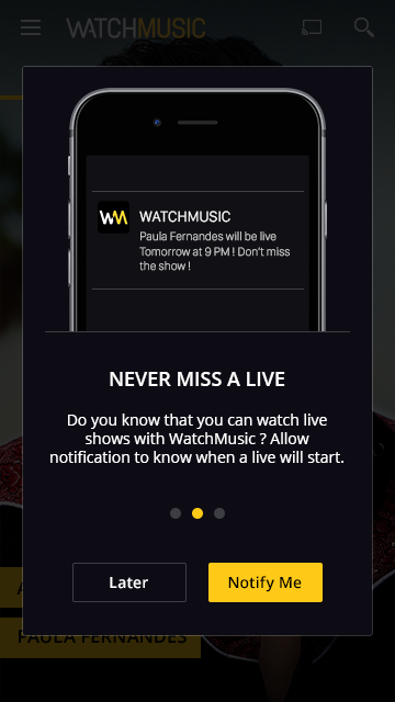
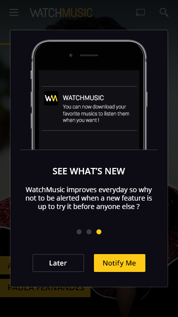
However, I proposed a second solution, which was to explain the benefits of notifications through a short tutorial.
Features - Lyrics
01. Research
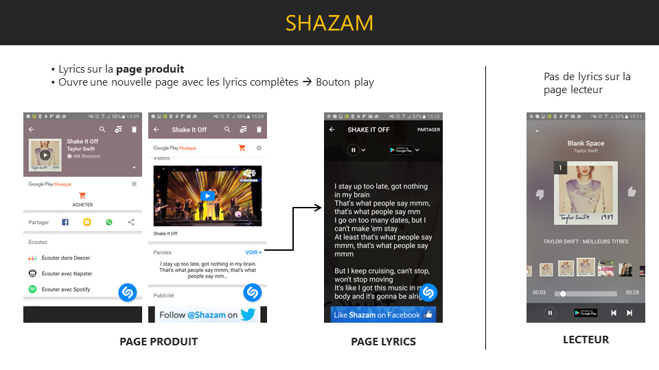
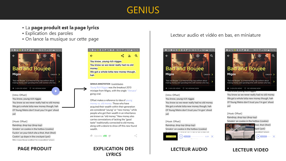
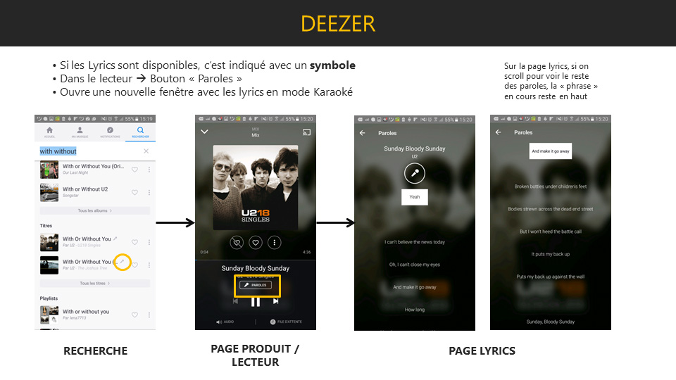
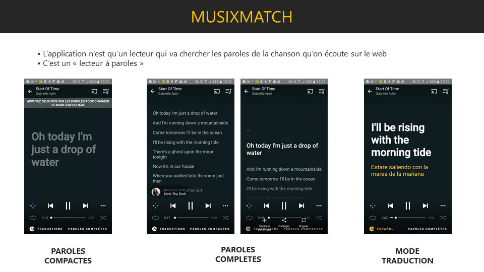
The first thing I did was to benchmark other applications that offer lyrics or karaoke features.
02. Base
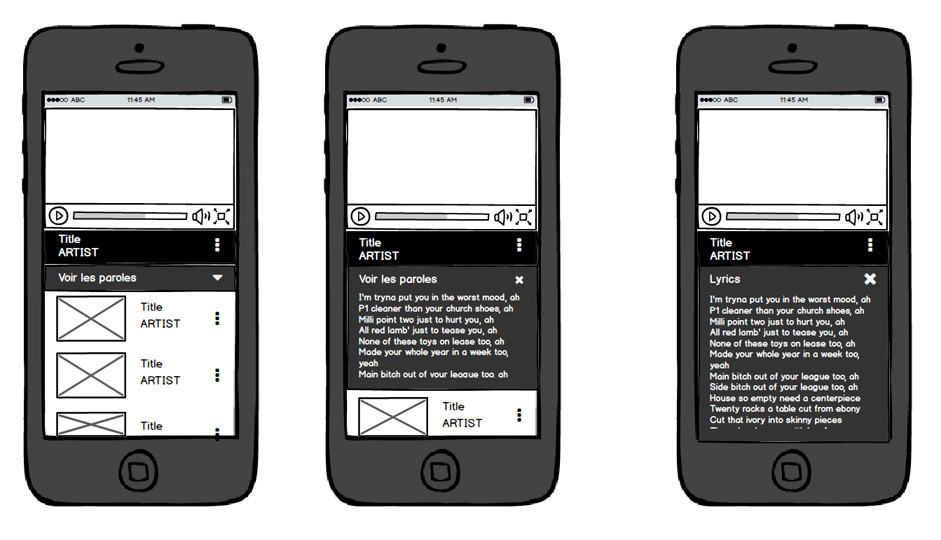
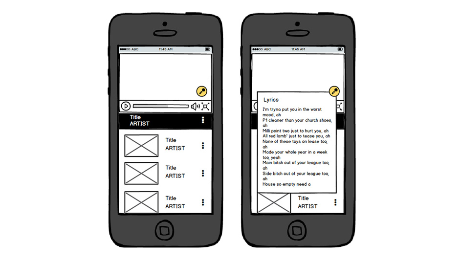
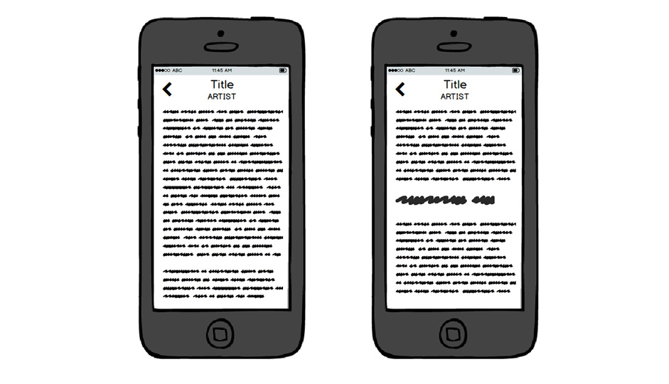
After that, I proposed different solutions for our service. One of the main points was that we didn't know if we just wanted a lyrics feature or a full karaoke experience. So I made different proposals to meet these two different perspectives based on my previous research.
03. Solutions
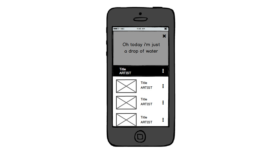
Finally, we decided to have a karaoke experience, easily activated and dismissable, where you can also navigate through the lyrics without following the song and return to where you were with a single click to resume your karaoke.
Animations
One of my main activities for Watchmusic was to work on all the interactions and animations of the application. Sometimes it was just testing to try different things, but on other occasions it was for the real features we wanted to implement. You've already seen some of them at the beginning with the homepage, but here are some more animations.
Conclusion
Thanks to Watchmusic, I was able to lead the development of many features throughout the creation process: research, benchmarks, wireframes, mock-ups and even animations... I also had the opportunity to participate in user tests. But most of all, I was able to work on interactions and animations that have become a part of my daily work that I particularly like.
At the end of this project, we explored other possibilities, such as virtual reality for concerts for example. But at that point, the company merged with another one and finally the application and the Watchmusic project came to an end.
Thanks for reading ! ✌
If you want to discover more awesome projects, click here !
Watchmusic Neon
Motion
Watchever
UI/UX/Motion
O'Gaming
Graphic Design
Another Death
UI/UX/Game Design
