Watchever
A video-on-demand service with a varied catalogue
Introduction
Watchever was a subscription-based German SVOD (video-on-demand service) platform offering a varied catalogue of series, films, cartoons and documentaries.
The service was created in 2013 and at the beginning of 2016 we wanted to broaden its catalogue with the arrival of musical content (clips, lives...) but also sports and esport content. With this, we wanted to offer a complete video-on-demand service in as many categories as possible. It was time for a complete overhaul of the site and the application.
That's when I joined Watchever for my senior year internship. I joined a team of 3 designers and was in charge of many tasks, from benchmarks to wireframes and mock-ups conception and even to motion design.
Goals
Be coherent
Create for each category its own universe while paying attention to its own particularities.
Be unique
Despite the different universes, keep a unique and recognizable identity to our product.
Research
01. Esport
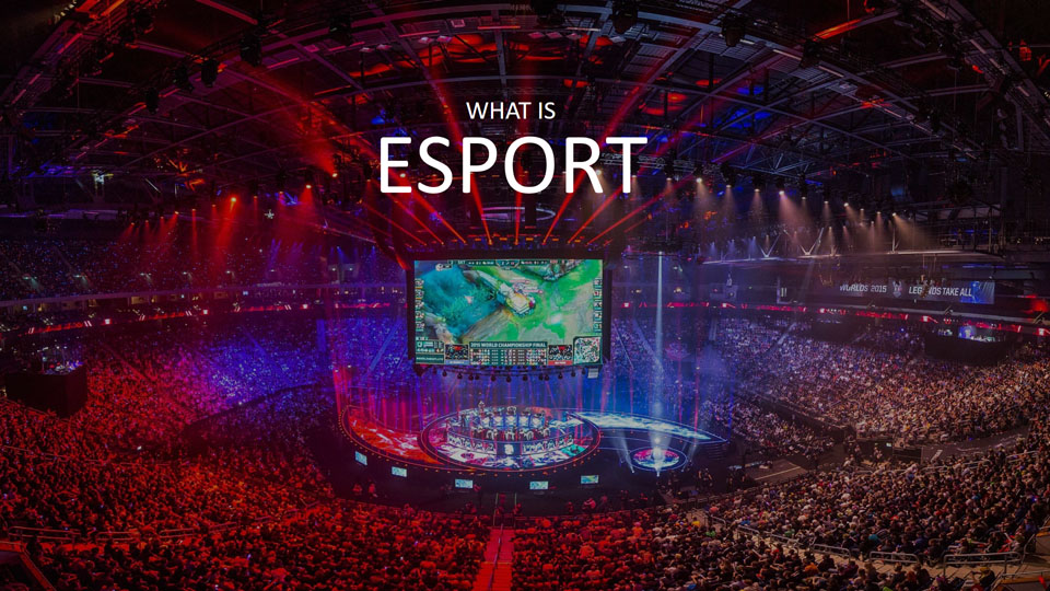
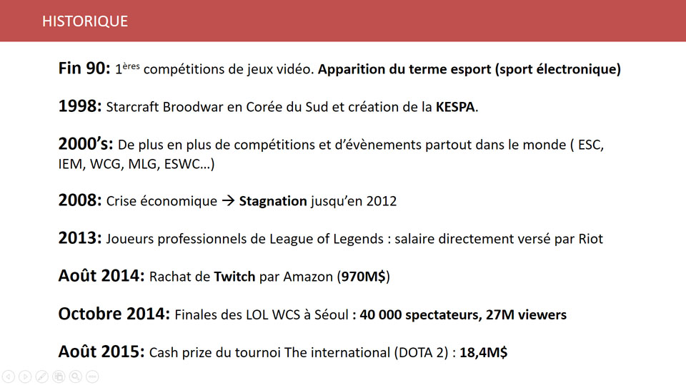
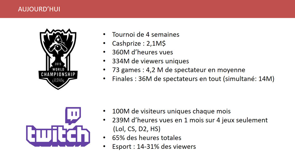
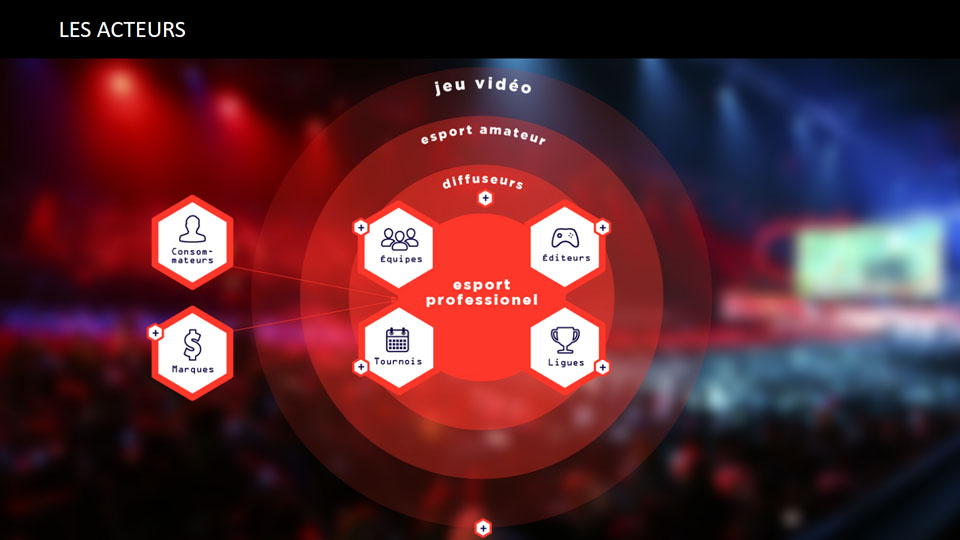
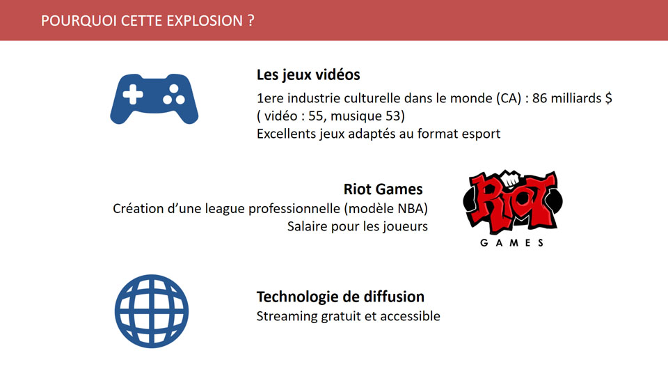
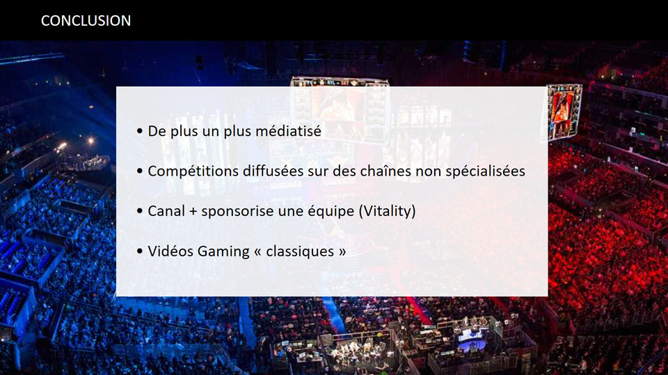
One of the new categories that Watchever wanted to add to its catalog was esport videos. Esport is one of my passions and I was the one in the company who was most interested in it. So I was chosen to make a presentation on this subject that will serve as a knowledge base for all the teams as we wanted to integrate this field into our service.
02. Cross contents benchmark
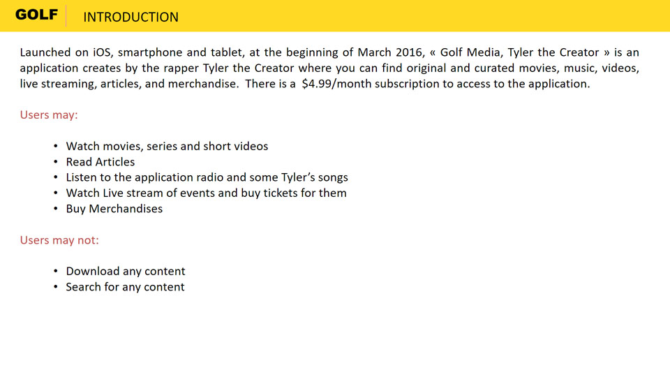
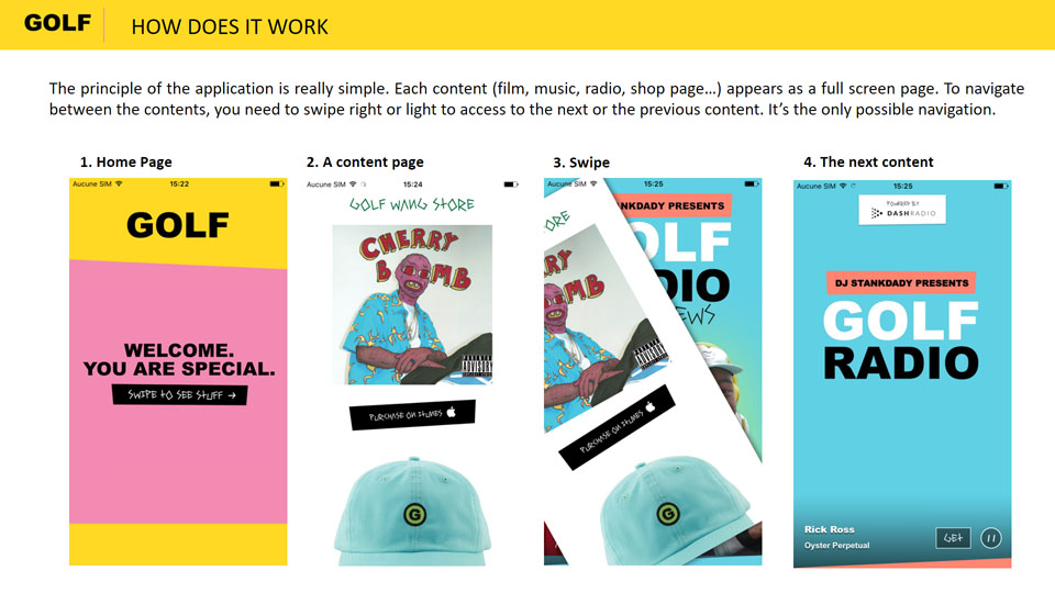
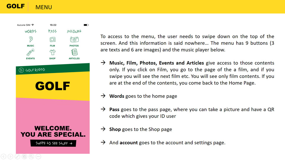
One of the benchmarks I did was to look at different services that offered different types of content (such as music, movies, series, podcasts etc.) to see how they handled that variety, how they presented it, whether they mixed them or not, whether they used the same presentation for each or not. So I analysed a dozen different services...
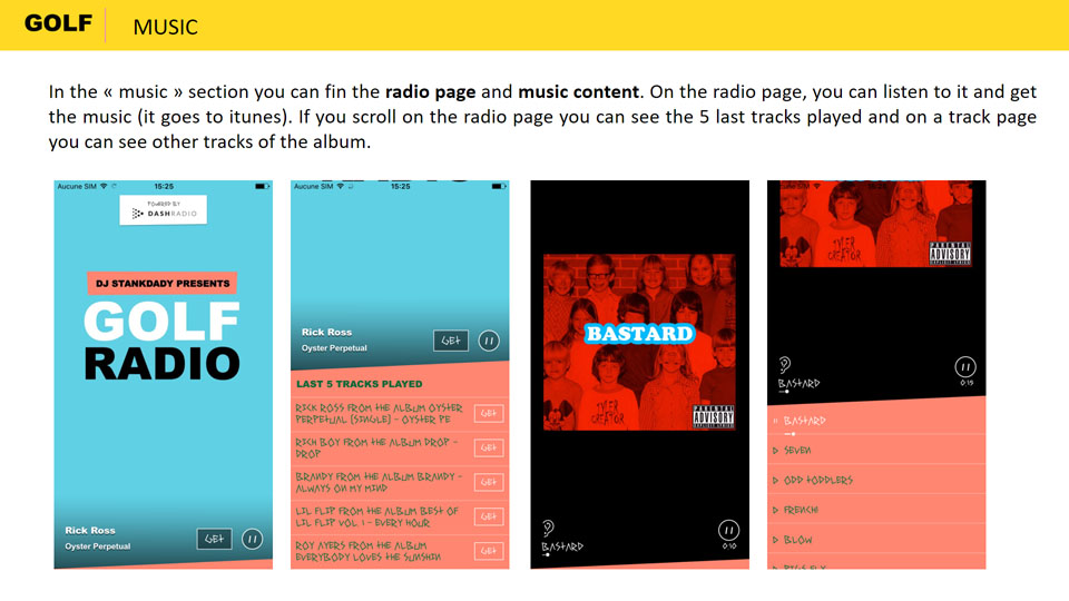
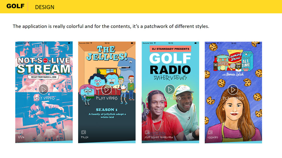
Among the various competitors offering different categories of content, the application by rapper Tyler had just been released and offered music, short episodes of series, interviews.... So I made a benchmark of this application, focusing in particular on the different universes and their treatments.
Base
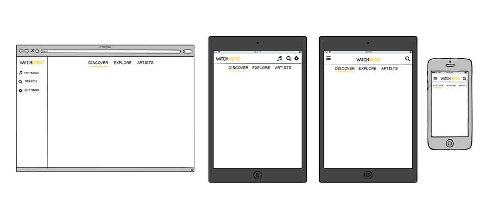
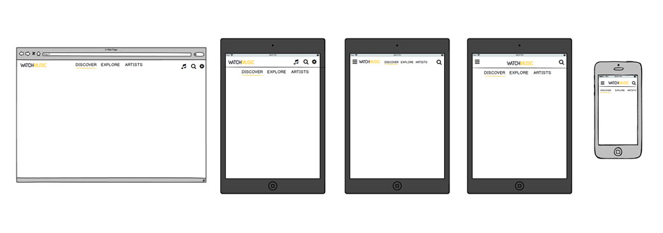
For this project, I worked on different wireframes, especially for the music part, as for example here with the responsive navigation of the website. I did some iterations with all the possible responsive versions.

Solutions
In the end, we focused our work mainly on Watchever's mobile and tablet applications. You will find below some of the features we have designed for these platforms.
5 different universes
By playing with the Watchever logo, its color and icon, we managed to make 5 different universes cohabit while keeping a clear sense of unity.
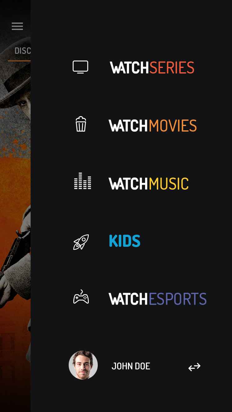
A unique homepage...
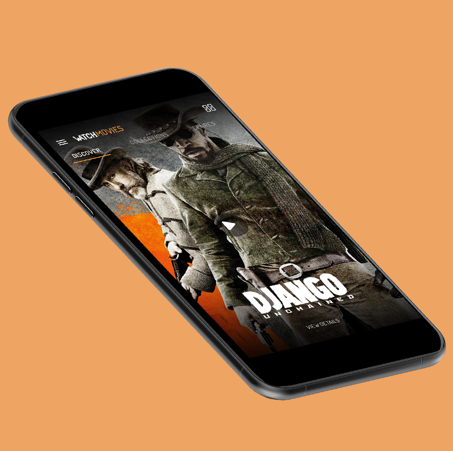
To ensure consistency of application, each category has a similar homepage. It's a discovery page with full-screen content for better immersion. By scrolling, you can discover more content.
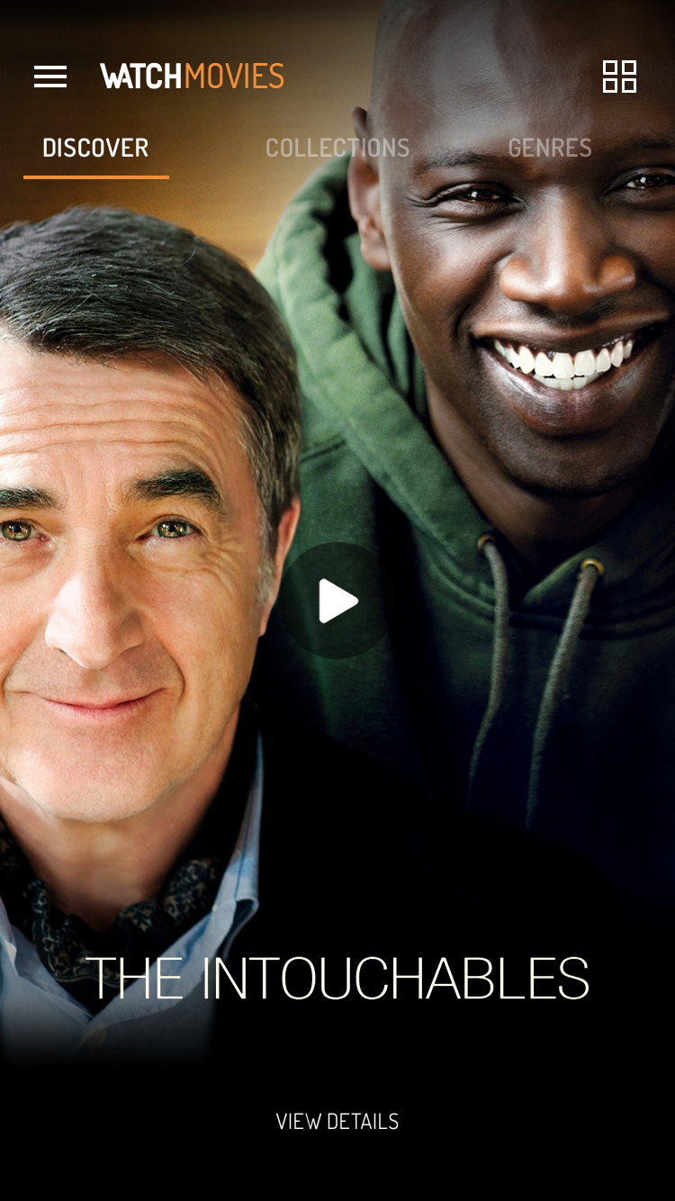
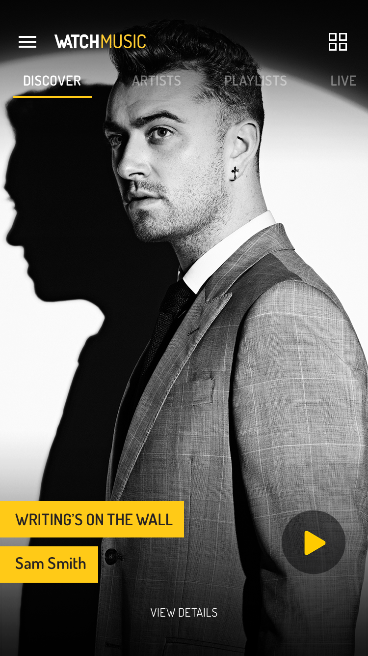
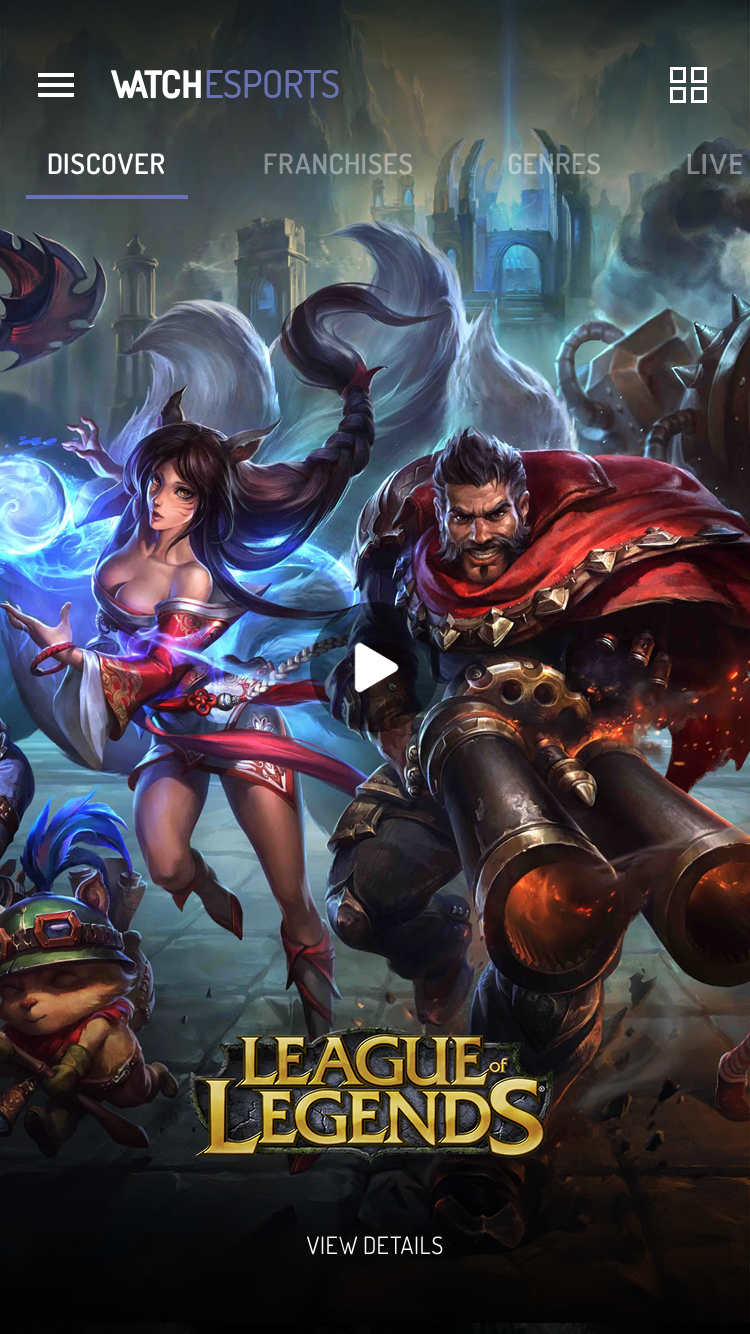
...but different categories
As each category has its own specificities, they all have sections that correspond best to them in order to better meet users' needs.
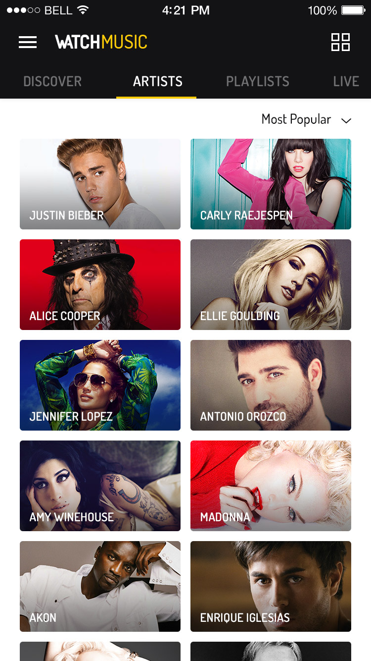
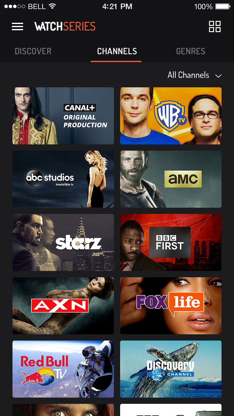
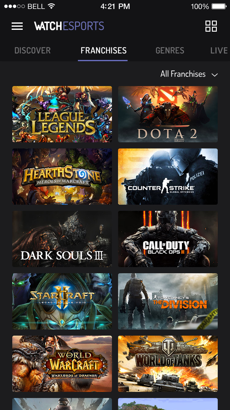
Cross content
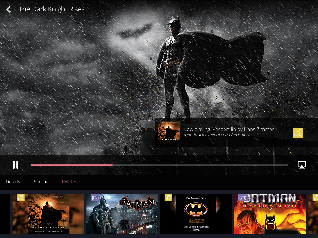
Each category is not an enclosed space. Thus, when a user watches content from a specific category, we offer other content related to the video but not necessarily from the same category. This way, we offer the most complete experience possible.
Animation
One of my main tasks on this project was to work on the interactions and animations of the mobile application to give the experience smooth transitions but also a recognizable identity, especially through the animation of the homepage.
Conclusion
This project was really important to me because it allowed me to explore different design areas while accomplishing many small tasks. In particular, I discovered interactive design. I always liked motion design but I never had the opportunity to use it for webdesign until this moment. It's now one of my favorite domains!
But after 6 months of work on this project, the company decided to change activity and cancel this product to focus on the musical part of the application: Watchmusic. I worked on this new project for one year and you can discover it here.
Thanks for reading ! ✌
If you want to discover more awesome projects, click here !
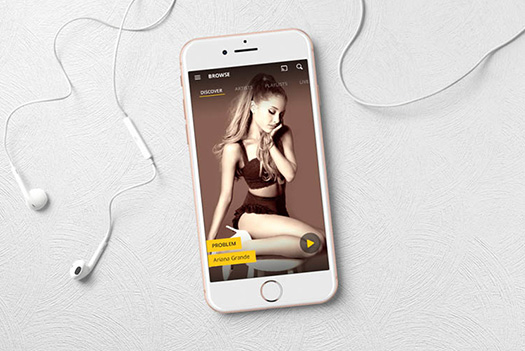
Watchmusic
UI/UX/Motion
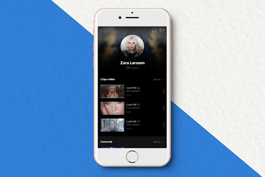
Watchmusic Neon
Motion
Les Vieilles Charrues
Brand Identity/UI
Dailymotion
UI/UX/Motion
