Les vieilles charrues
Create a new visual identity for a famous music festival
Introduction
Les Vieilles Charrues is one of the biggest music festivals in Europe and takes place every year in Brittany, France. As part of a school project, we had 4 days to create the visual identity of the 2015 festival. We had to adapt it on different printed and digital supports by creating a flyer, a poster, goodies, responsibe website mockups, an application...
In a group of 5 people, I was responsible for the artistic direction of the project but I also worked on some pages of the website.
Goals
A wonderful world
Create a full universe around the concept of a wonderful and magical world.
4 days
We were really limited by time because we only had 4 days to do everything.
Research
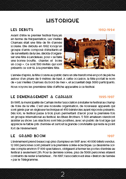
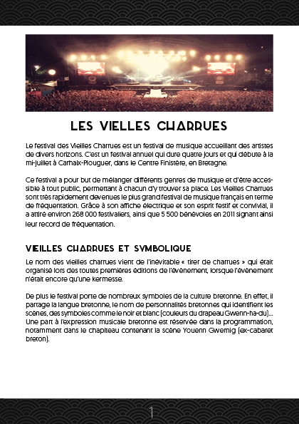
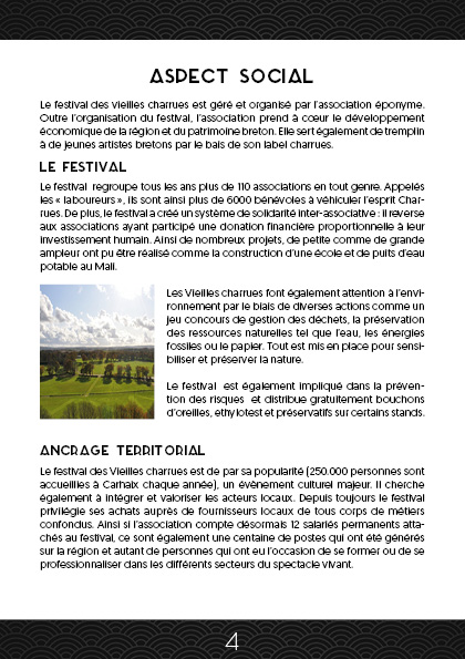
Before starting to look for the new visual identity, we did some research on the festival Les Vieilles Charrues to better understand its history and values. Thanks to this, we were able to give the Breton festival a coherent identity.
Artistic direction
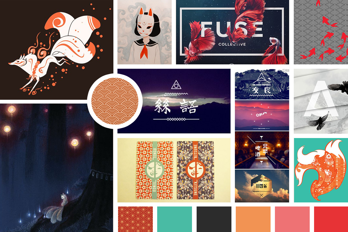
01. Moodboard
We had a "wonderful world" as a theme for our project, so we decided to start from Japanese legends that are full of imaginary creatures. That's where we got our inspiration.
02. Logo
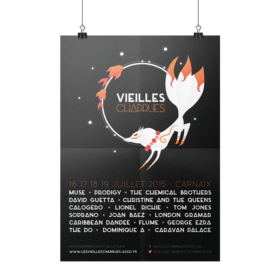
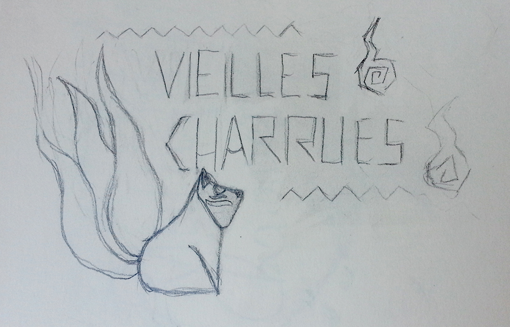
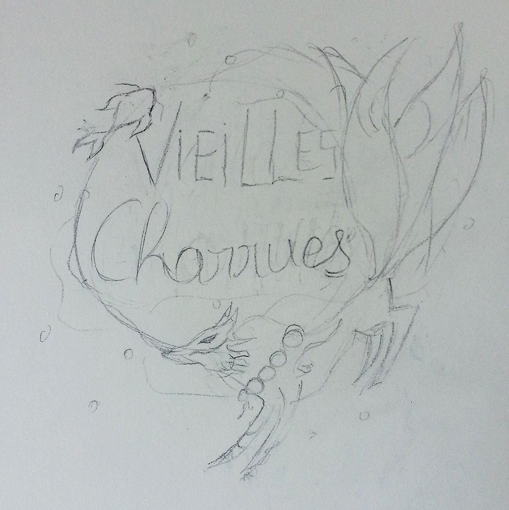
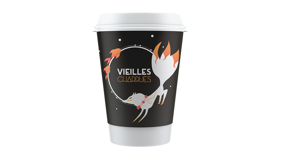
For the logo, I chose a Kitsune, a magical creature very present in Japanese legends and which looks like a fox. To underline the mystical side of the wonderful world, I tried to play with other elements of Japanese folklore such as koi carps, masks or even will-o'-the-wisp.
Our final logo is composed of simple geometric shapes and two visuals that represent emblematic figures of Japanese culture. Our two large circles refer to the moon and our small ones to the stars that accompany our koi fishes and kitsune.
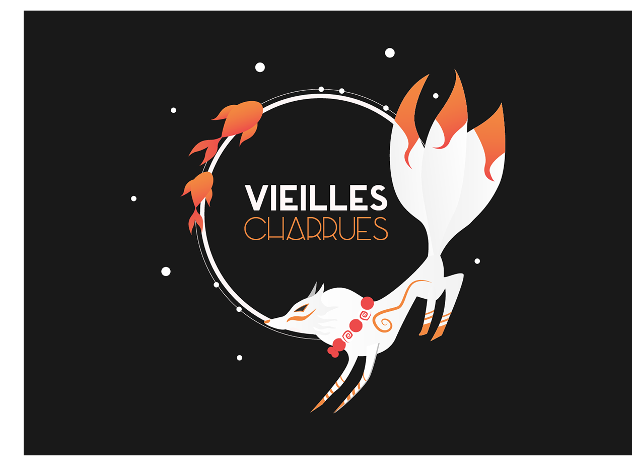
The logo was quite large and complex, so we decided to make a second version that is smaller and can be more easily adapted to smaller formats.
03. Visual identity
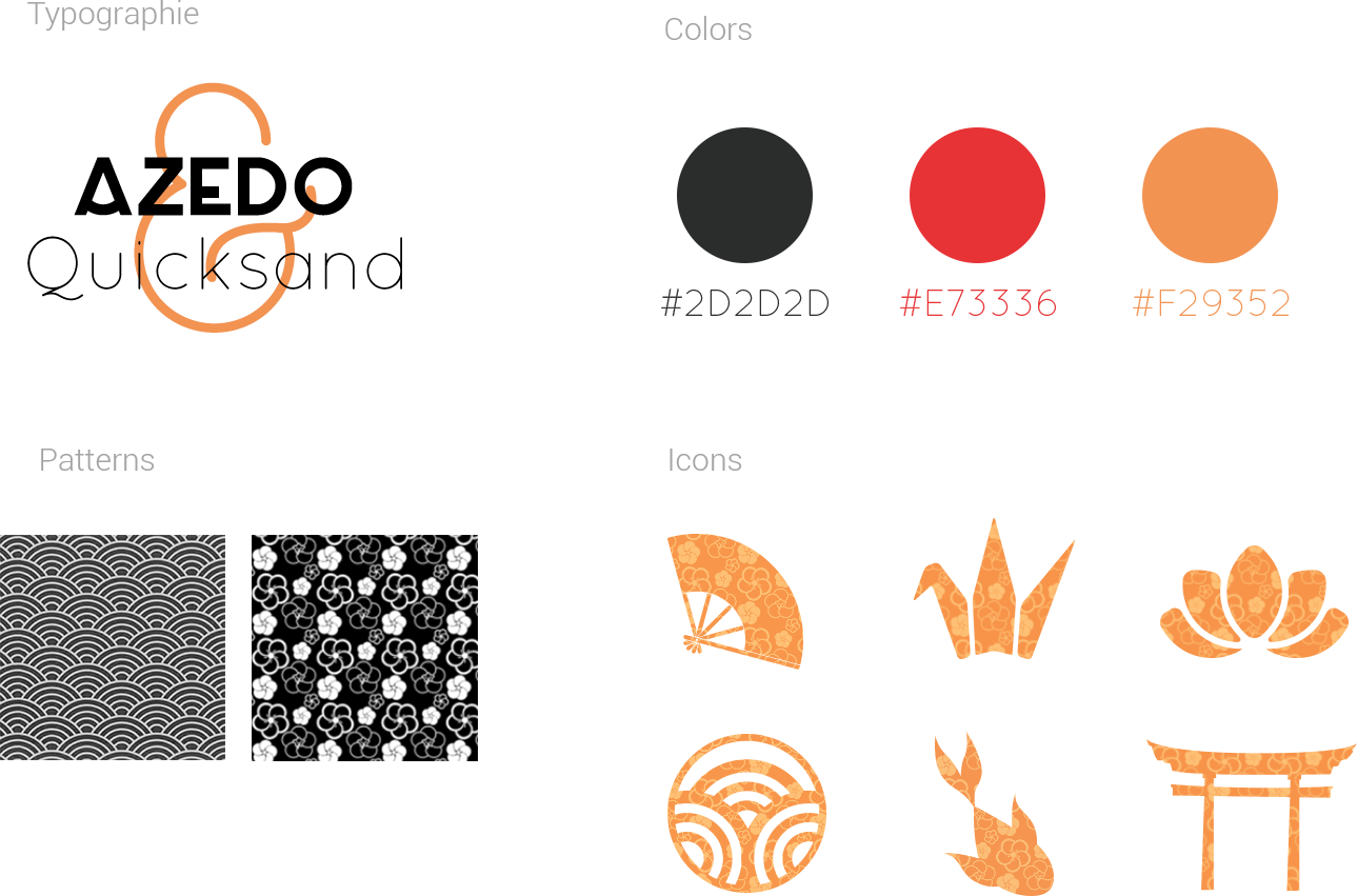
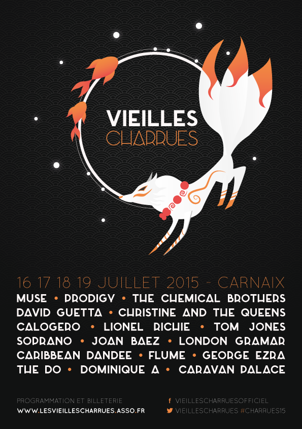
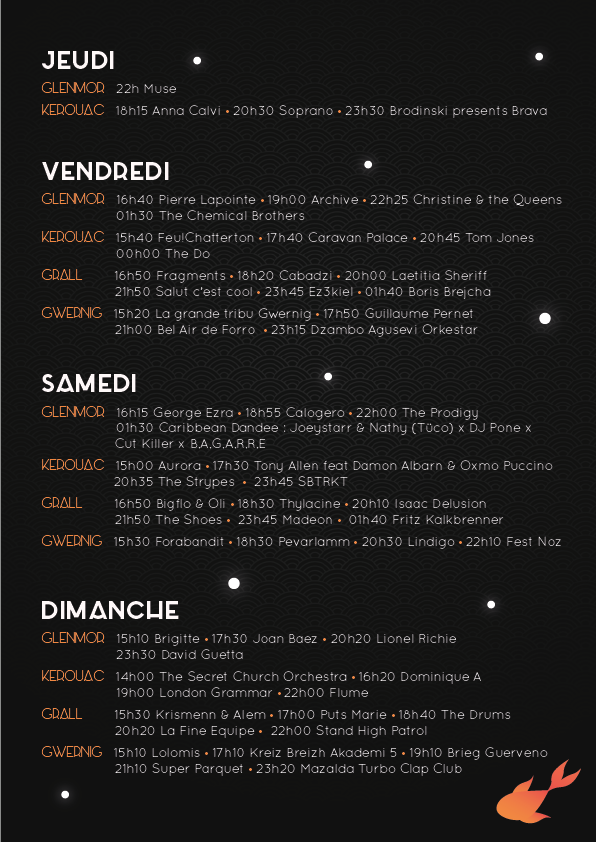
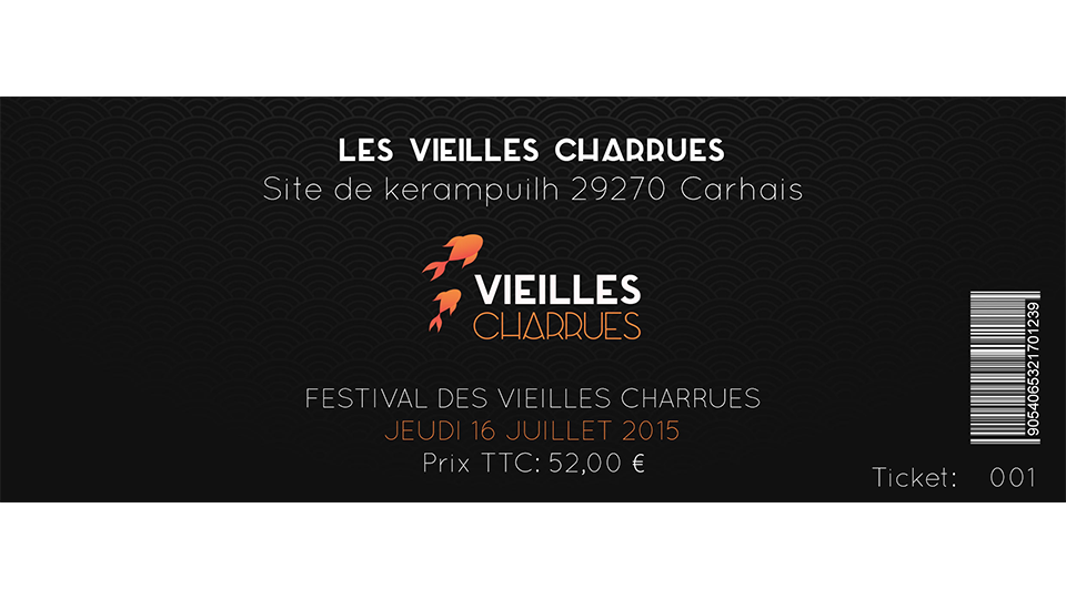
04. Print and goodies
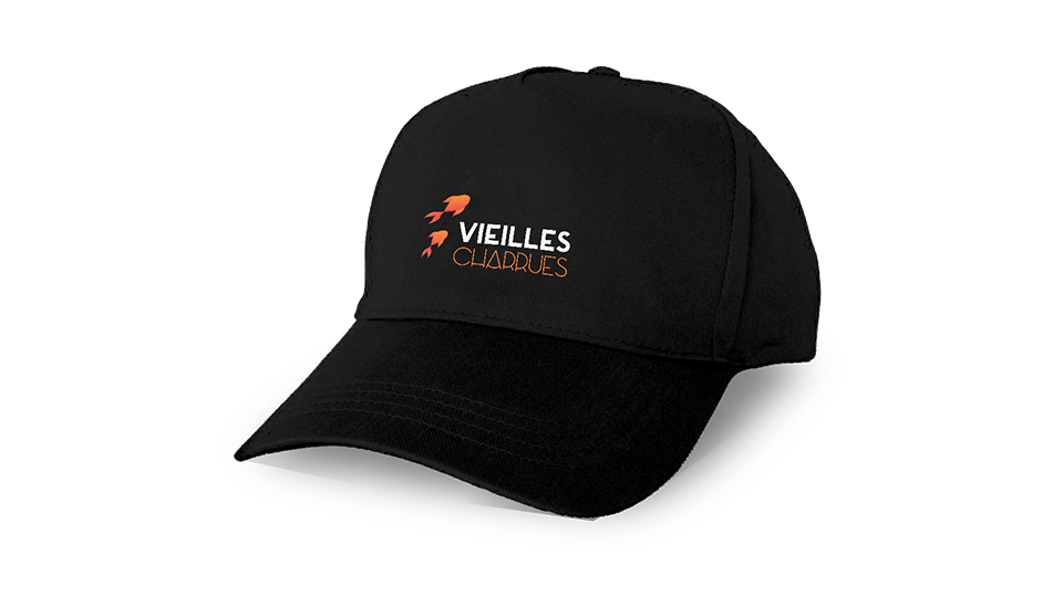
Respecting our graphic identity, we have created certain printed elements such as event posters, tickets or even goodies.
Solutions
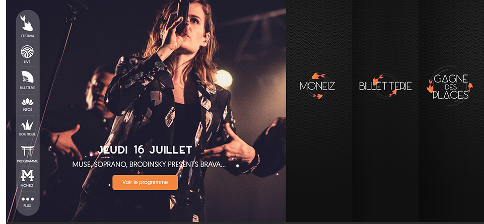
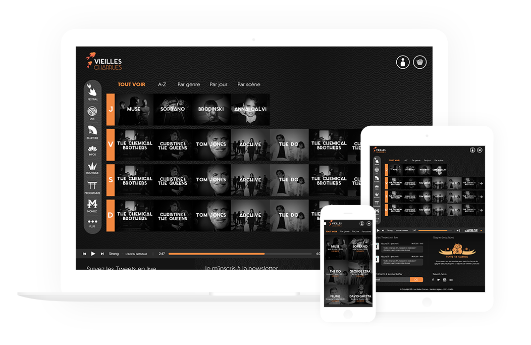
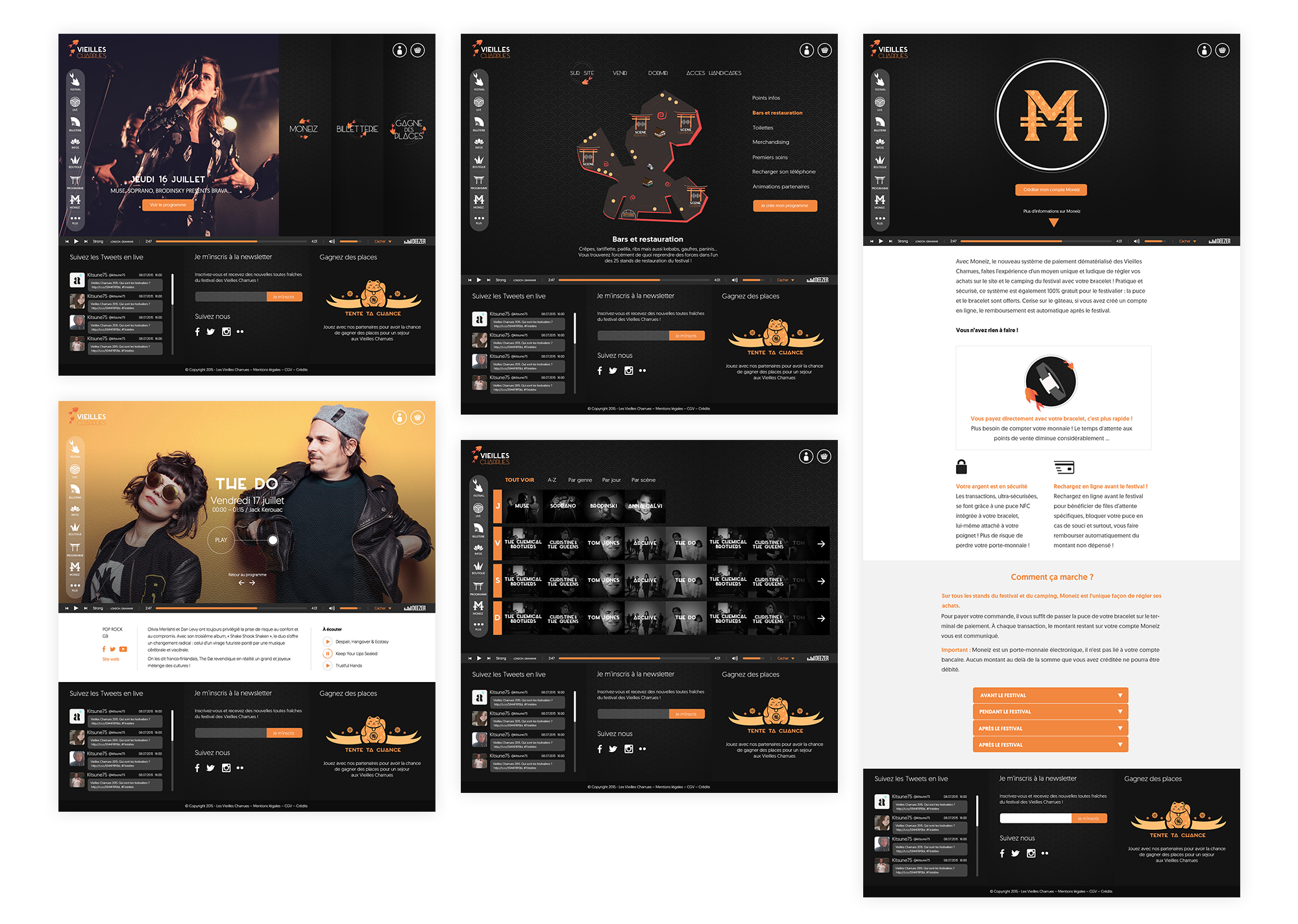
For this project, we had to create pages for the website with a responsive version for desktop, tablet and mobile. We gave the site a graphic coherence while respecting the identity of our project. We also thought about how to give our users the best possible experience on our website.
A strong visual identity
We used elements of our visual identity such as the koi fish, patern and Japanese-inspired icons to create a unique visual experience.
A player that follows your path
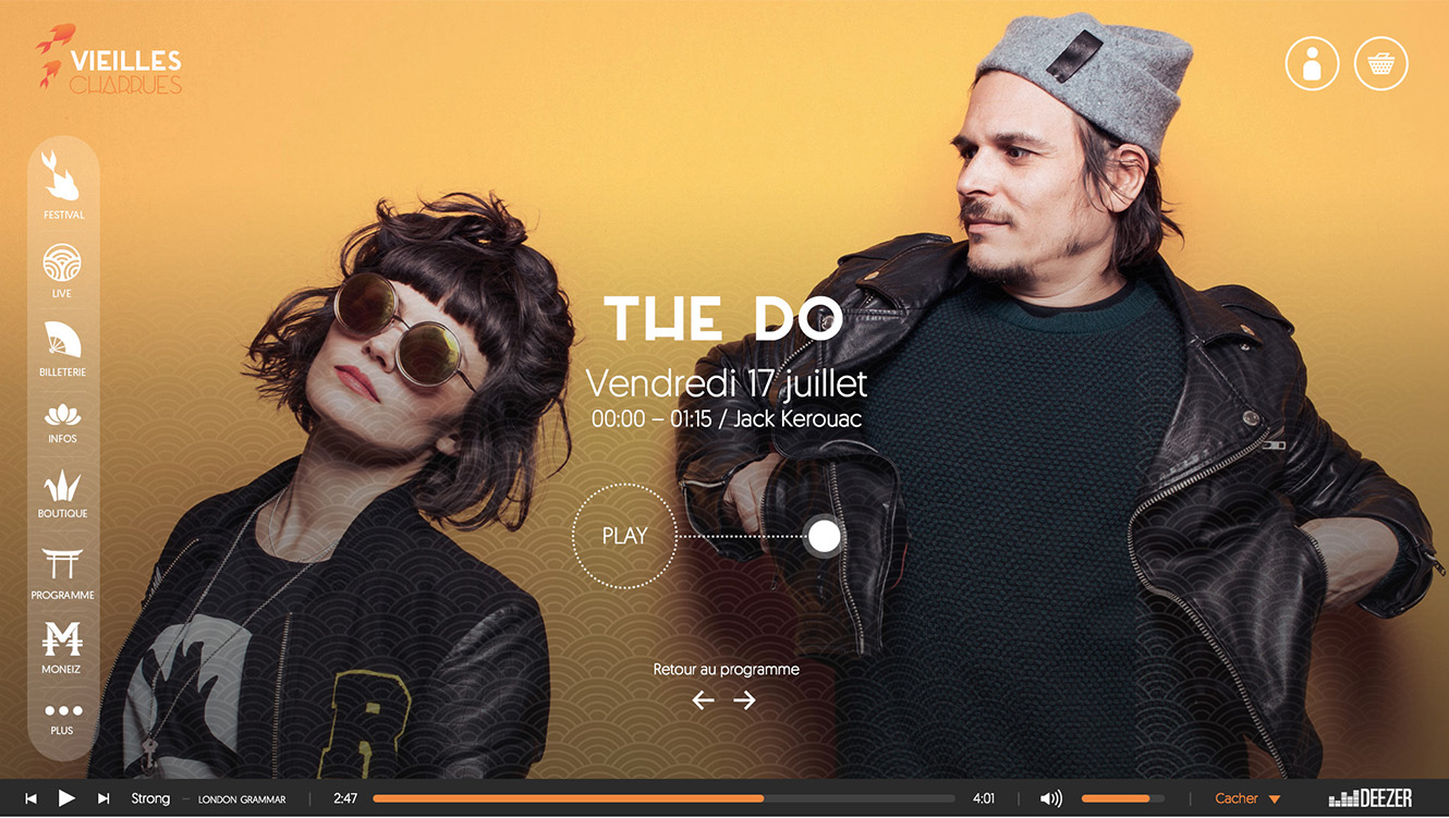
As Les Vieilles Charrues is a music festival, we wanted to give an important place to music. So we thought each page so that it could integrate a music player at the bottom of it. This player follows the user in all his navigation. Of course, he can also stop it whenever he wants.
Responsive design first !
One of the most important things we worked on was the responsive version of each page.
Conclusion
This project was really intense because we had only 4 days to create a graphic identity and to decline it in different prints and goodies, to realize the complete structure of the site, to make five pages of this site in three different sizes and to design an application! To get there, we obviously had to share the tasks between us, we were a group of 5 people but even with that, we had to work very fast and under pressure!
But in the end, even if we missed a few hours of sleep (haha), we were really happy and proud of our work! And I was particularly glad to have the opportunity to work on the graphic identity of this project. It's something I've never done before, I really enjoyed it and I learned a lot!
Thanks for reading ! ✌
If you want to discover more awesome projects, click here !
Another Death
UI/UX/Game Design
Watchmusic
UI/UX/Motion
Help Center
UI/UX
Dailymotion
UI/UX/Motion
